Improving Karma’s user-journey - From making an order to check out
For this school project, I choose to work with the Karma app. Karmas business plan is to sell food from restaurants, cafés, and stores for a discounted price that otherwise would get thrown away. Great for the environment, your wallet, and the businesses. I have experience working at cafés and have seen the issue myself. It's a big amount of food that gets thrown away because it's not baked the same day even if it's still good. That's why I took the challenge to make this app even more user-friendly during my Rapid Prototyping module at Hyper Island.
School project -
Rapid Prototyping module
Duration: Nov — Dec 2020
Role: UX/UI Designer
Tools: Sketch, Axure RP
1. Empathise with the users
To step into the user’s shoes, I went through the user journey, from opening the app to check-out, myself. The pain-points I spotted were turned into assumptions and also a storyboard to visualize scenarios to clearly describe what needs to be improved.
2. User-test the current user journey with a Lo-Fi prototype
I created a Lo-Fi prototype to isolate the user journey I want to improve, but also to help the user-testers to focus on the functions rather than details such as colors and fonts.
Current user-journey
3. What I learned
From the user feedback, the users wanted to see the food options as soon as they enter the app.
I didn’t get any feedback about not being able to turn off their location.
When the users didn’t find any food on the first page, they looked for a search bar.
The users didn’t share a need of having their food delivered.
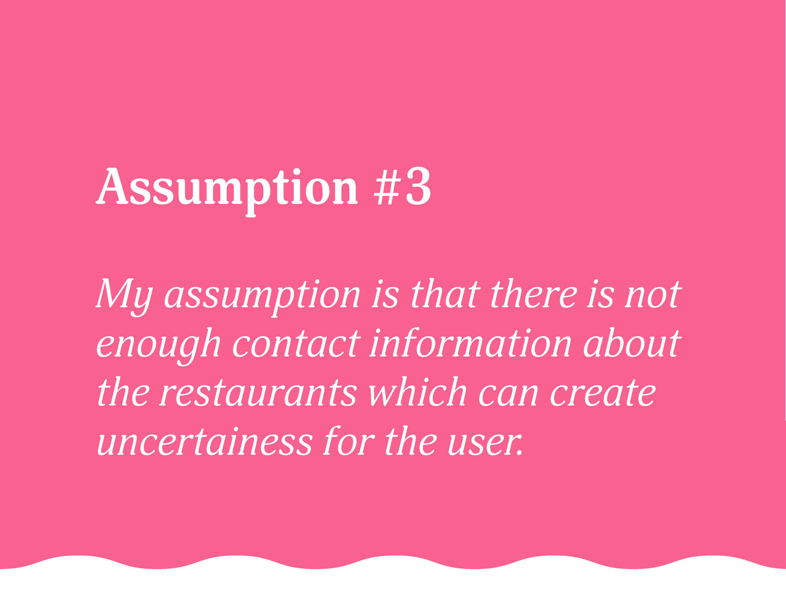
When I asked the users to call the restaurant/café/shop they had to close the app to find it.
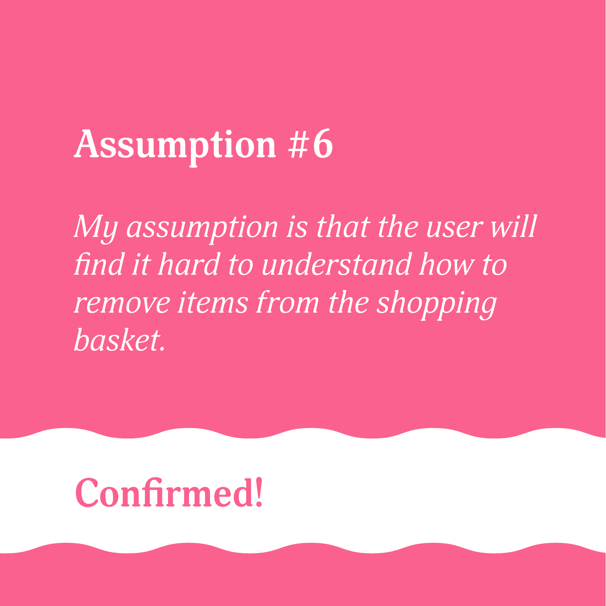
When giving the users the task to remove an item from the basket they had a hard time understanding how.
4. Design Changes
5. Next steps
By creating a rapid lo-fi prototype I was able to learn fast what problems the users were facing when using the current app. This became the starting point for my design changes. But this is just the beginning and I would further test my design decisions.
The next steps I would have taken would be to:
Have another user-testing with the new design and iterate further on what I learn.
Test my hypothesis "if users can order food that is far away from their location, then the users will order more”. This can be tested by an A/B test on some of the users to see if it will convert more orders.
If I would have access to the user data I would look closer at where the highest bounce rate was and analyze why. I would use the data for new design decisions.
6. Learnings
Test fast, fail fast, and learn fast.
Start by creating a lo-fi prototype to focus on the functions before I going down to the details with a hi-fi prototype.
If I would do it again I would analyze what area would give the most value for the least effort. I would for instance start to find the best solution for the check-out experience.


